🛠 Instabug Dashboard - Heuristic Evaluation
Type: UX Audit | Role: UX Reviewer & Designer | Tools: Notion, Screenshots, Heuristic Framework
Timeline: 1–2 days
Company: Interview Task from Instabug
As part of a product design interview with Instabug, I was asked to evaluate their web dashboard using heuristic evaluation principles. While Instabug is a powerful tool for bug tracking and in-app feedback, even robust products benefit from usability refinement. My goal was to identify friction points in the interface and offer actionable improvements — without direct access to their internal user data.


Overview
1. Empathize
Conducted a call with a developer familiar with Instabug’s workflow to understand the product’s use cases and user expectations.
Reviewed a video walkthrough by Salma Ali on YouTube.
Explored the dashboard as a first-time user.
Defined primary users:
Developers focused on triaging and fixing bugs/crashes.
Product managers interested in surveys, crash trends, and bug visibility.
2. Evaluate (Heuristic Review)
I evaluated the dashboard against Jakob Nielsen’s 10 heuristics. Here are select key findings:


Process
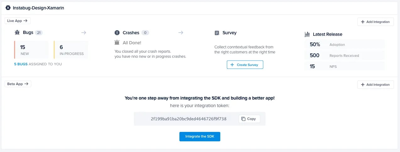
1.Empty Sidebar Creates Confusion
Violates: Consistency and Standards
Sidebar shimmered on load but remained empty, which felt like a bug or server issue.
✅ Recommendation: Remove it entirely if it serves no function.


🧭 Key Usability Findings & Recommendations
2.Redundant App Entry Points
Violates: Recognition vs. Recall
Dropdown and app list created confusion.
✅ Recommendation: Remove the top dropdown for clarity and reduce visual noise.
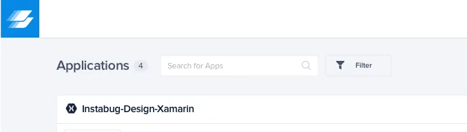

3.Unclear Clickable Titles
Violates: Recognition vs. Recall
App names are clickable but not styled as such.
✅ Recommendation: Use distinct color or underline + add a “View App” CTA for clarity.
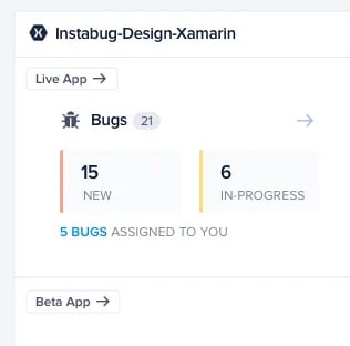
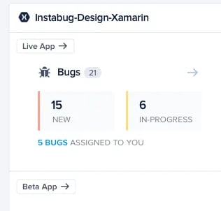
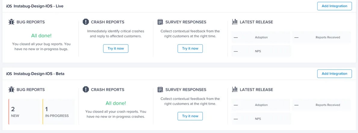
4.Poor Tag Differentiation (Live vs. Beta)
Violates: Recognition vs. Recall
✅ Recommendation: Use color-coded tags or icons for faster scanning.


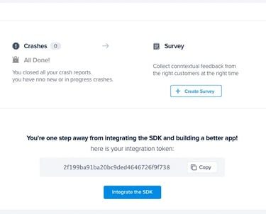
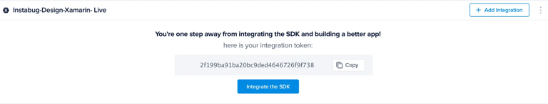
5.Redundant Instructional Text
Violates: Aesthetic & Minimalist Design
✅ Recommendation: Rewrite for brevity, split copy into bolded action + supporting text and better visual hierarchy.

6.Team Members Hidden Behind Clicks
Violates: Recognition vs. Recall
✅ Recommendation: Show avatars when members exist, and make them accessible from the global UI.


7.Inconsistent CTAs for “Create App”
Violates: Consistency and Standards
✅ Recommendation: Unify “Add New App” and “Create App” CTA styling and hierarchy.


8.Missing App Management Options (Edit/Delete)
Violates: Flexibility of Use
✅ Recommendation: Show “Edit” and “Delete” on hover, following standard UI patterns.


9.Live/Beta Apps Not Visually Grouped
Violates: Recognition vs. Recall
✅ Recommendation: Group related versions under one app card visually.
Before
After